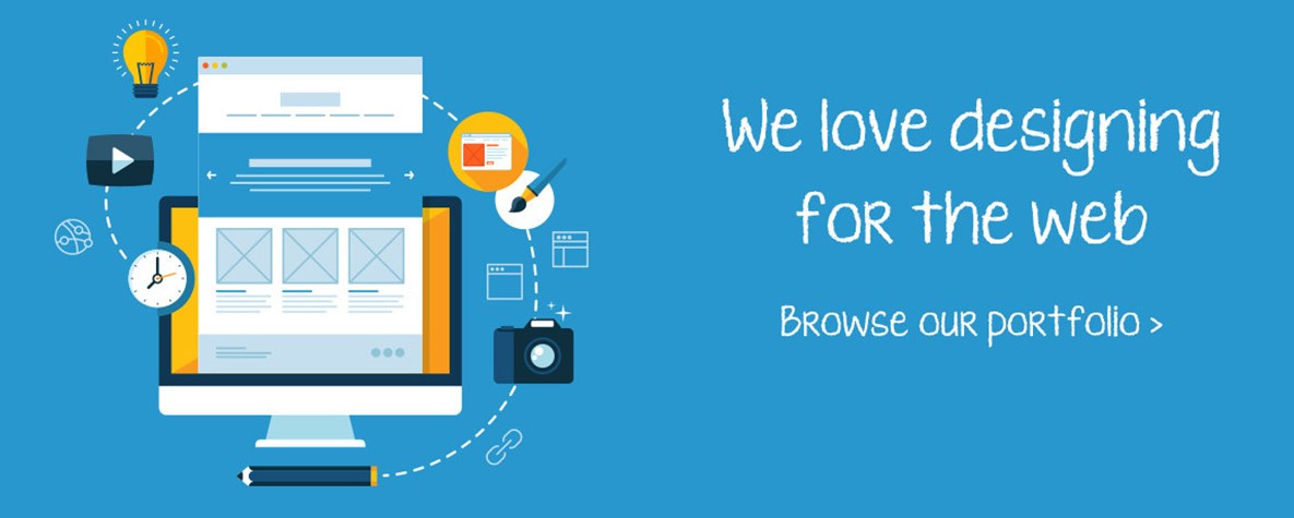
The website is becoming a fast-growing industry in Dubai after the invention of smartphones. People love to have their website on the mobile phone so that they don’t need to open the laptop or start the desktops. Latest news is becoming easy if you want to see them on mobile. Businesses now cannot afford a non-responsive website which is the truth of the century. So most of the business persons are now worried to have a responsive website design. These tips and tricks will somehow help you in making responsive website design.
People usually use a website different than desktop when they are on their smartphones. You can have a survey that how your website is using and also you can get the analytics. You have to see why your audience is using the website on the mobile phone and which page item they are looking most if they are coming on the website through the phone. Make a smart navigation of the page which is the user priority.
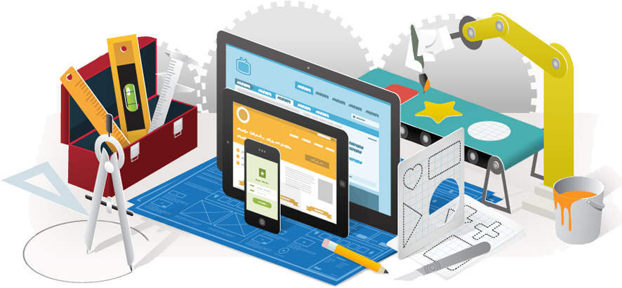
The design has to be the plan first
When you are going to design a website you have to know all the details about the layout of the website. Most of the designers make wireframe then the design of website before touching to the coding part. This will help you get the knowledge that how the website will look like. It also lessens the effort of the designer to make a brands website and integrate it with the business needs. Some tools are used in this regard for the mobile adjustments such as InVision, Adobe Edge Reflow, and WireFy.
Navigation should be carefully built
In a website, the important part is the navigation. Because it is giving a roadmap to the visitor so that they can access each and every page of your website. Links to all important pages was the concept of the desktop so that is becoming old with the invention of smartphones. On mobile devices, it is like a hamburger and all the links are behind it. This is not good approach also because it never makes a website design helpful for the user. Most important menus have to be visible on the website even if it is opening on mobile phones. Homepage text can use to give links to other pages is also a great approach using for navigation.
Images have to be optimized
When designers are designing website images play an important role. Most of the images connect the audience with the brand emotionally. The customer is attached to the products or services after watching the images of it. So the selection of images in website designing is one of the crucial tasks. On the other hand, when you making a responsive website optimization of the images means a lot. On the other hand, you have to select the image with the proper formats such as PNG and JPG. Mobile has a lot of bandwidth issues so be careful.
Mobile First Approach
If you are a designer you have to make a smart decision and make a mobile version of the website first. This will lessen your effort in the responsive website design. All the things including texts, images, logos, and other elements are according to the small screen which is more effective for the audience. Your audience will love the way you make the website if you are doing it for mobile users first.
Comments