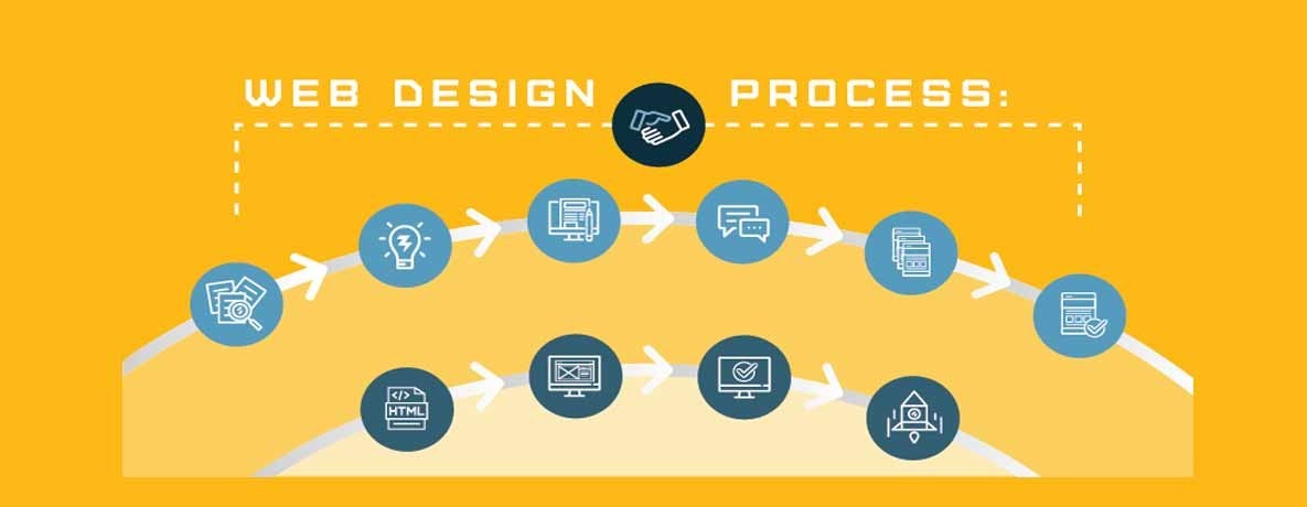
Here is a guideline in which we’ll discuss all those minor errors to avoid in future for better outputs.
Location of Call to Action
The first mistake that usually web designers make is to put the call to action button below the page fold. Usually, the first time sees and get the impact of the site by page fold. It’s the area of page visitors see without any scrolling so place it on this area otherwise the visitors will not get the information what you want to give them and ultimately it will decrease your conversion rate. For this purpose, website designers should use new browser size features for better results.
Visual Hierarchy
Images, graphics, animations and promotional banners have a beneficial impact, but sometimes excessive use in term of distracting the visitor’s attention will lead to bad impression and create a hurdle for the visitors to complete the tasks on web pages that should be done by them according to the goal of a website. To solve this problem, the webs designers should use new technology and tools to keep balance the eye flow on your web site. By improving the eye flow on web pages, you can easily show the visitors what they want to find. It will also help to give a perfect balance of images and content on web pages.
Use Creativity under Usability rules
Website Designing in the field of creativity and something new and exclusive in your web design elements. But your creativity should not break the usability design rules that it loses all the impact to increase conversion and make your users confuse on your website. Use your creativity in such a way that visitors can easily understand all the features on your website. If the visitor will not be comfortable by your unique added feature, it doesn’t have any impact. Before introducing any new thing, try to test it in testing tools to make sure how visitors will react to it.
Content arrangement
There is a massive impact on the content of your website on the visitors. It should be engaging, easy to understand and interesting. Don’t place it in long paragraphs. To grab the attention of the users, make headlines, subheads and bullets points of vital text to achieve the goal of your website and to attract more visitors to increase conversion rates.
Testing
It is a very common mistake that website designers try to make a perfect and attractive design having variations in terms of design elements. But they don’t test it on different browsers that how the website will function on different browsers and how users will react to different variations. Functionality is an essential element to increase conversion rates. You can use various testing tools for significant outputs.
Conversion rates of your website
Common errors that effect Conversion rates of your website


Comments